SAIC ID v2.0
Revisiting my previous SAIC ID project.
Archived 📦
6 min read
After developing my very first UIUX project, SAIC ID, I’ve always thought of developing the project to refine and re-interpret the the interface and the experience of the application but I always did not have a chance to do it (a typical excuse for not doing work). And (So) finally, after an entire whole year, I finally had a chance and decided take the challenge.
Live Simulation: SAIC ID v2
Disclaimer - This project is a simple investigation and an exploration in developing my previous project.
Revisiting a project that I’ve done previously is definitely something that is not done easily nor should be done easily - there’s always a pressure that I have to make the App better, in both in visually and in experience - which is one of the reasons that I believe designers and engineers receive so much criticisms (even if the updated App is actually good). But, no doubt, it is one of the effective way to study, and improve as a designer.
Brainstorm
Whenever I try to start a project (in this case, making it better), it is always helpful to start with a list of strong objectives with description for the project.
Objective: To help and minimize the time spent on finding and using the Student ID card throughout the school service.
Since this is a simple re-interpretation for a previous project I’ve decided to change the hierarchy of importance to focus more on underscoring the commonly used functionality and make improve on the experience of such functionalities. For this project, I’ve decided to focus on four main areas:
- Barcode Reader
- ARTICard Balance
- Class Schedule
- Tool Checkout
Here are few sketches / quick brainstorms:
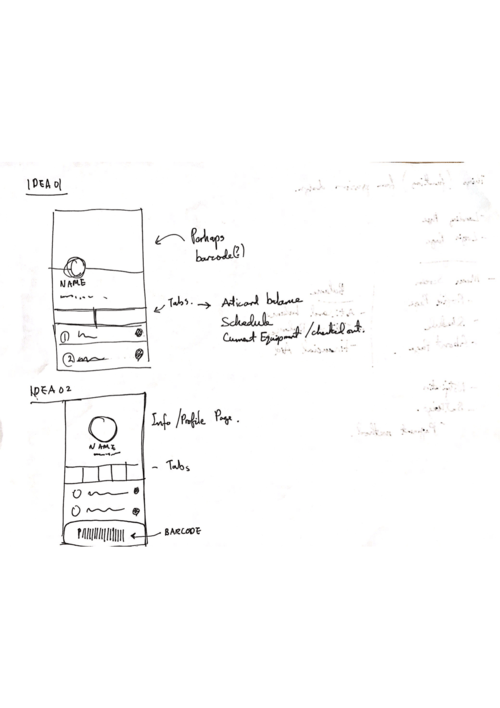
Initial Sketch
There are three main component in the basic sketches: Barcode, Profile, and an area for ARTICard / Schedule and Check-out (Media).
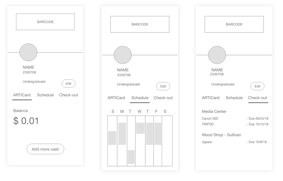
Also added some variation on the main profile layout:
Adding a variation to the sketches definitely helped to follow choices which are more user-intuitive. For example having a Barcode bar on the bottom seems more intuitive than having it on the top due to the location of the hand and thumb normally situated.
Also having the profile area being centered seem to offer more focus to the important part of the App; it creates balance and definitely pleasant to look at.
But this stage is still an initial design. I should still stick with both variations yet.
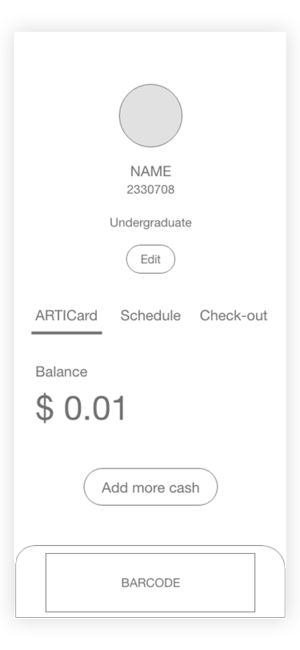
Developments
After pulling off few variations with initial sketches, I’ve decided to add some more UI elements to these sketches.
The list of element that focuses on the first variation:
- Square / Rectangular
- Large Barcode at Top
Advantages:
- Able to scan the barcode right away as soon as the App is opened.
Disadvantages:
- Have to reach to the top to get to the barcode.
- Barcode might take too much space.
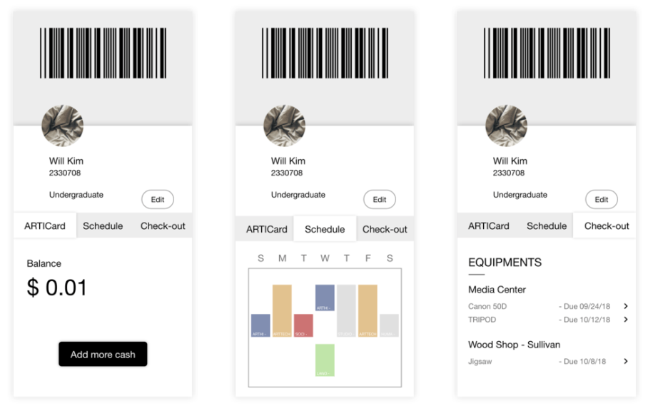
The list of element that focuses on the second variation:
- Circular / Smooth
- Barcode at the Bottom
- Center Aligned UI
Advantages:
- Smoother UI
- More space on the top - could be used for different functionality apart from profile
Disadvantages:
- Might feel too empty.
- Able to scan the barcode when the App is open, but intended to make the user to press the barcode to enlarge the Barcode (two-step process instead of single process).
Final
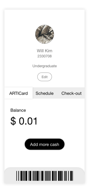
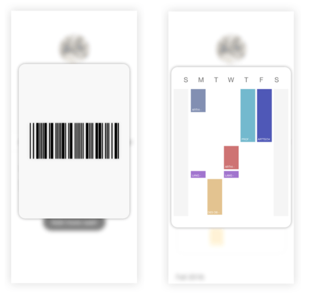
With objective being to help and minimize the time spent on finding and using the Student ID card throughout the school service, the most important feature of the app is the Barcode. While the first variation of the design definitely offers a large area of the App to be used for scanning. There was another issue where the users did not feel that area was used for scanning - instead, even though the Barcode was big enough for the scanners to read them, many users still clicked the barcode area to see if that area was highlighted.
I thought if the users felt a need to press the Barcode area even if the area was big enough, I thought the second variation provided much better approach in solving the problem as the interface intuitively informs the users that it is an element that can be enlarged / highlighted.
To further develop the app from the development, I decided to try out the second variation.
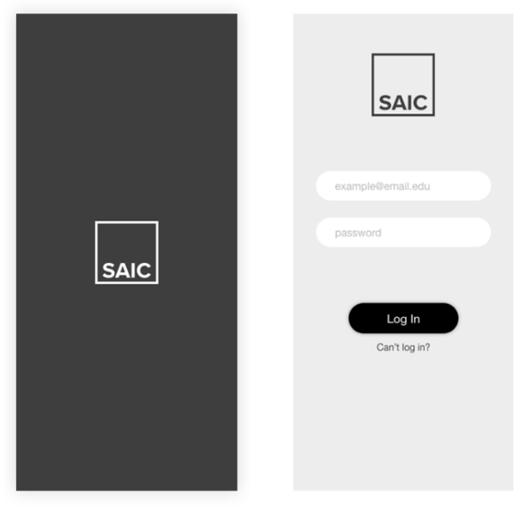
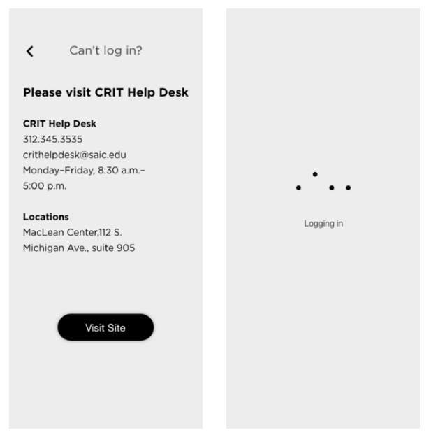
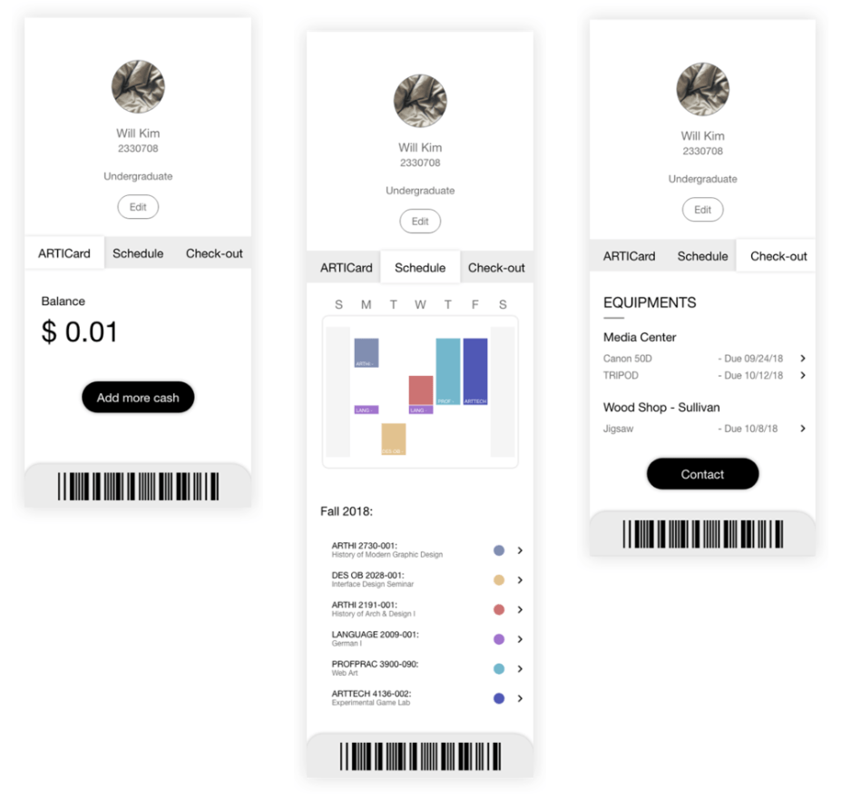
Conclusion
Revisiting an old project was definitely a fresh experience, it definitely introduced some interesting and unique problems that was not present when I was starting a fresh new project. In regard to improving the SAIC ID, the main takeaways for this project were:
- Highlighting the main functionality of the App is definitely a plus - minimize down the functionality into handful features. After that just focus on that.
- Hierarchy is important - Guide the user what I want them to see first. Project the experience that I can offer to the user.
- Convenience for user experience is critical for main features - For this case, it was a Barcode, and I think the having it to the bottom was an ideal choice (and have a pop-up).
Some personal takeaways:
- Having a wireframe sketches to investigate compositions and simulate multiple layout is very helpful.
- Color and aesthetic may not be that important. Rather it is more about the experience; how can the app guide the user to feel certain way as my intention?
- Keep asking - am I solving the problem (Objective)? It was so easy to diverse myself away from the main goals. I kept all the memos for new ideas that I thought of during the project.
After doing this project, I felt I wanted to see what I can come up with when I revisited other old projects. This project was surprisingly satisfying, once it was done.